It has been interesting to look at all the different helmet designs out there. Lots of different designs, colors, patterns, etc…a bit overwhelming. However, I realized pretty quickly I like two different styles. The first is more basic with just a few colors, clear patterns, and easily recognizable from a distance. I would think these would likely be created with more tape/stencils while the second is virtually all freehand.
I took a bunch of screen shots and have tried to group them below and list them in order of preference. At the very end I also included several Austin Healey graphic items to consider.
Favorite Helmets
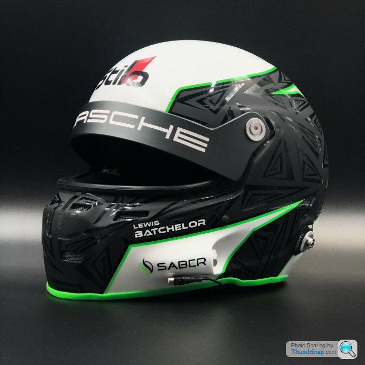
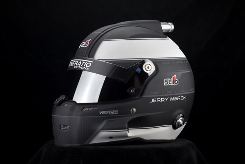
The first helmet is tied with my most preferred helmet. I like the black and white balance and having an accent color. I wonder how the black would look if it just showed the carbon fiber underneath. Would like to have an Austin Healey script across the to of the visor or somewhere else.

———–
This helmet is tied for first. I really, really like the basic colors and basic appearance. The Austin Healey script could replace the Porsche script. I don’t mind the little triangle graphics in the black area but maybe there is another option. Again, I wonder how it would look to have the carbon fiber show as the black area and maybe no triangle things or replace the triangle things with something different?
————–
The helmet design is a little more busy that the designs above but I really like this helmet as well. I wonder if I like it because of the relatively few colors and enough white to make it look clean. I don’t have a picture of the top and front of the helmet. I could see removing the British flag portion.
—————————
This helmet resonates with me as well. It has few colors, a simple pattern, and good colors. I could see how my name, blood types, etc could be placed in the black area on the back of the helmet.
——————
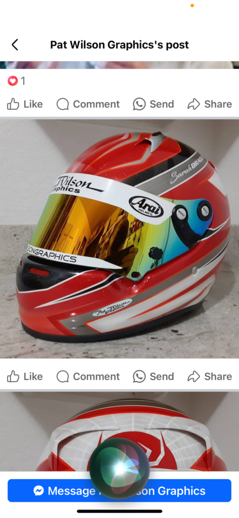
Another design of yours. I really like the diagonal pattern on this one…it is very recognizable. In what appears like a relatively straightforward diagonal pattern is a quite complex design. Really cool. The spider pattern is not really my style so maybe that would just be white.
Second Favorite Helmets
The following represent my second favorite helmets. Mostly uncomplicated with cool patterns and colors.
Very much like this helmet. Fewer colors, good white space makes it a clean look. Maybe use one of the round Austin Healey logos on the top?
————————–
The following helmet is simple (maybe too simple) but it harks back to more classic helmet designs from the 60s but with a modern interpretation. Incidentally, the car is an Austin Healey.
———————–
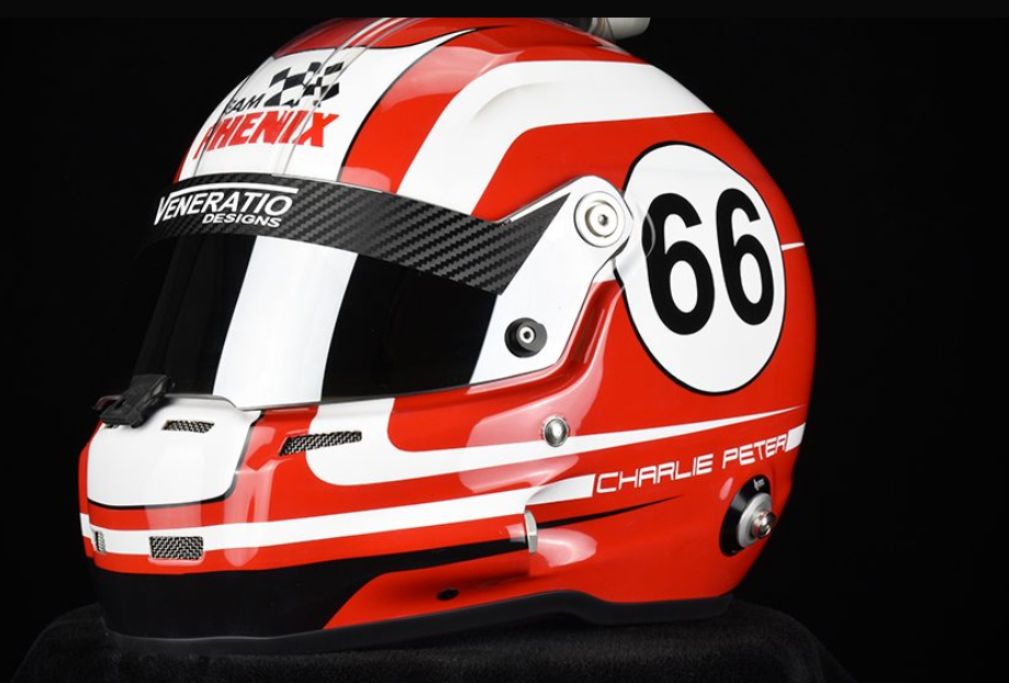
I also really like the following helmet. Not many colors, recognizable design. I could easily see the Austin Healey script in place of Phenix and use my 103 number design in the circle….maybe with PistonVista.com under the number but still within the circle. This one reminds me of older styles of race helmet designs but with a modern twist. For some reason the design reminds me of helmets that might appear in an older Indy 500 race.
————————————
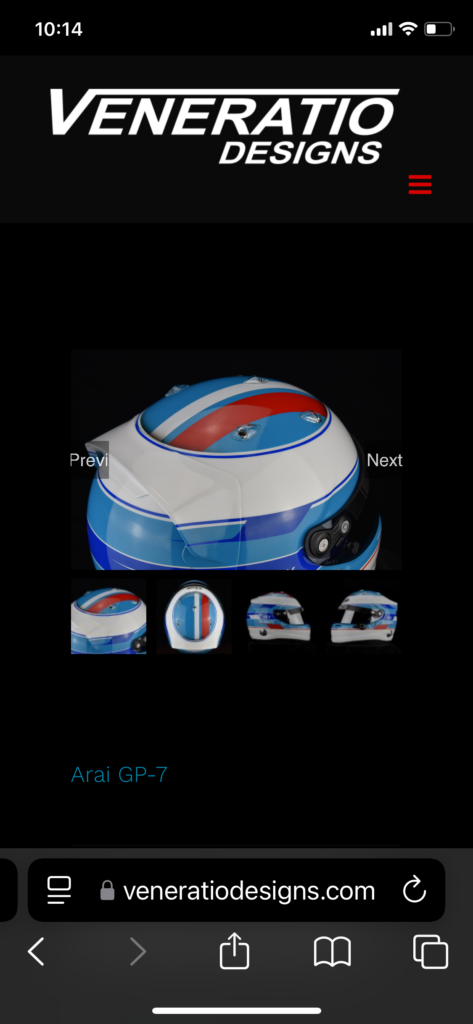
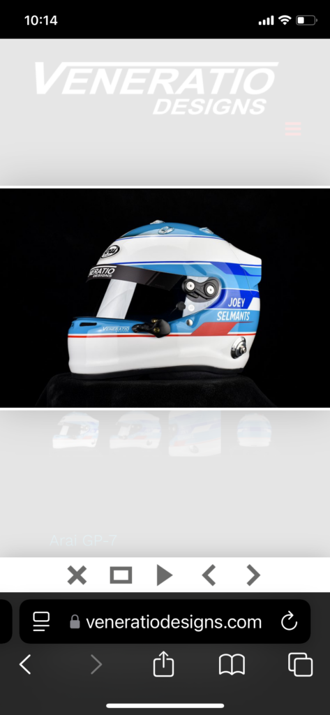
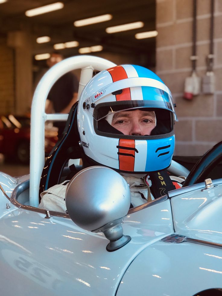
I like the relatively few colors and the bold, easy to see pattern. The Gulf colors are very cool but they don’t match what I would prefer on my own helmet. Maybe white instead of blue, carbon fiber instead of black, and Spruce Green or another color instead of red. Looks like there would be room for driver information on the back.
————————
Third Best Favorites
I debated on whether the following helmet should be in the third best favorite list or the second best favorites. I actually like the helmet quite a bit but maybe I don’t appreciate the overall appearance because of the black picture background.
————–
Another nice design but it feels to me like it just needs a little “pop” somehow.
—————-
This one is cool but really starts to diverge from what I prefer.

The Second Style I Like
I mentioned that during my search I found two styles I like. The second style is more hand painted…they are really, really cool. They look more like art than something to be used for actual racing. I imagine the cost point for some variant of this is quite high.
————————–
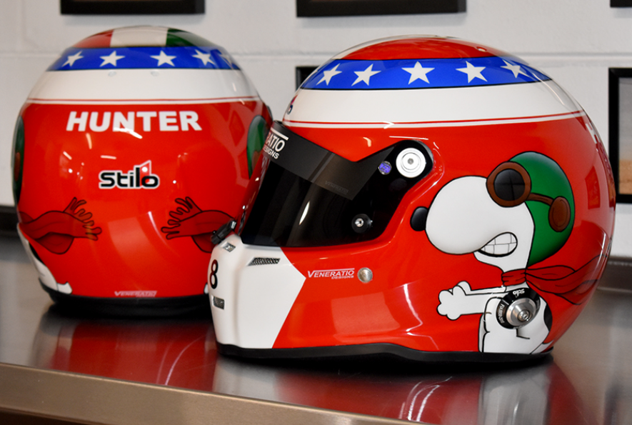
I know this sounds odd, but I like the fun factor of the following Snoopy helmet. Something like this would be a hit at the track. We invite kids to sit in our cars when they walk through the paddock, so a helmet with a cool character might get more kids to stop by.
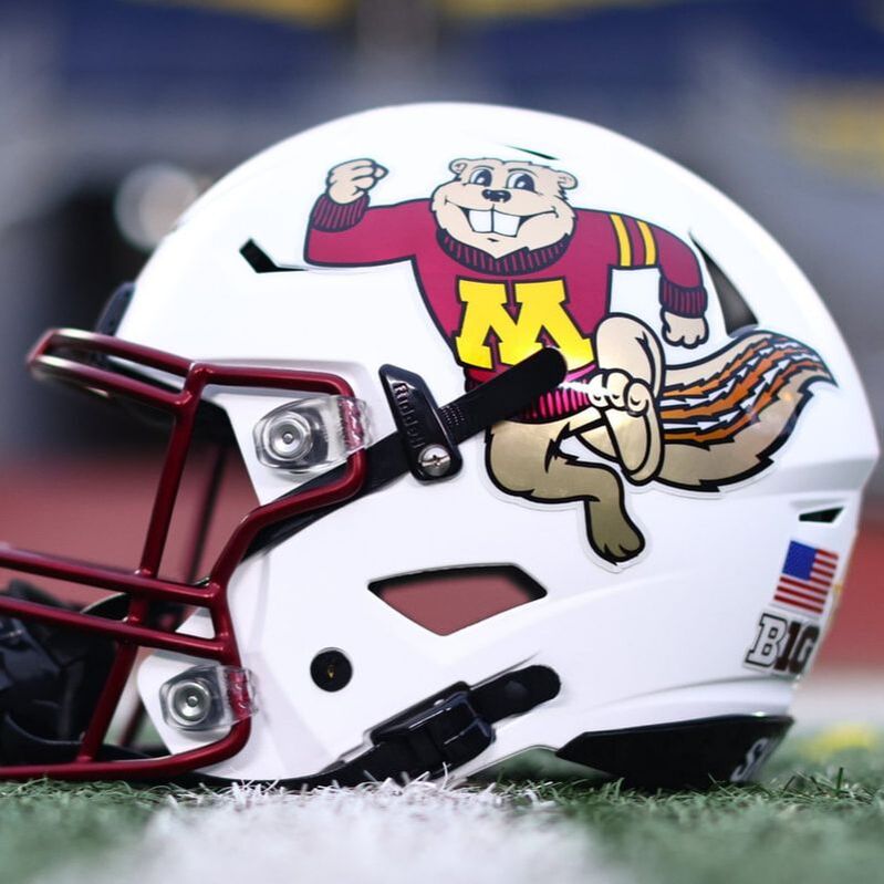
My alma mater is the University of Minnesota whose mascot is Goldy the Golden Gopher. The picture below shows a really common Goldy logo. Not sure how possible it might be to have Goldy on a helmet…maybe as the main element like the Snoopy helmet.
Other Notes and Comments
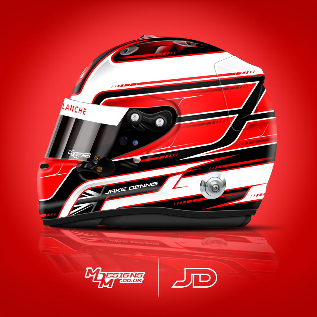
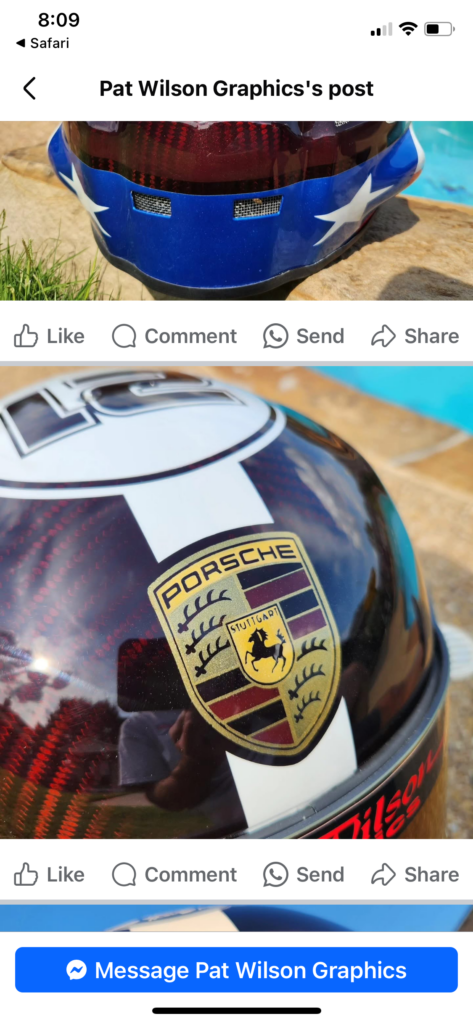
I really love how you included the Porsche logo into this helmet and i like the view of the carbon fiber. You are really talented!
Austin Healey Items
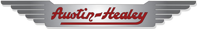
The following show shows the script and wings that are on every Austin Healey car.
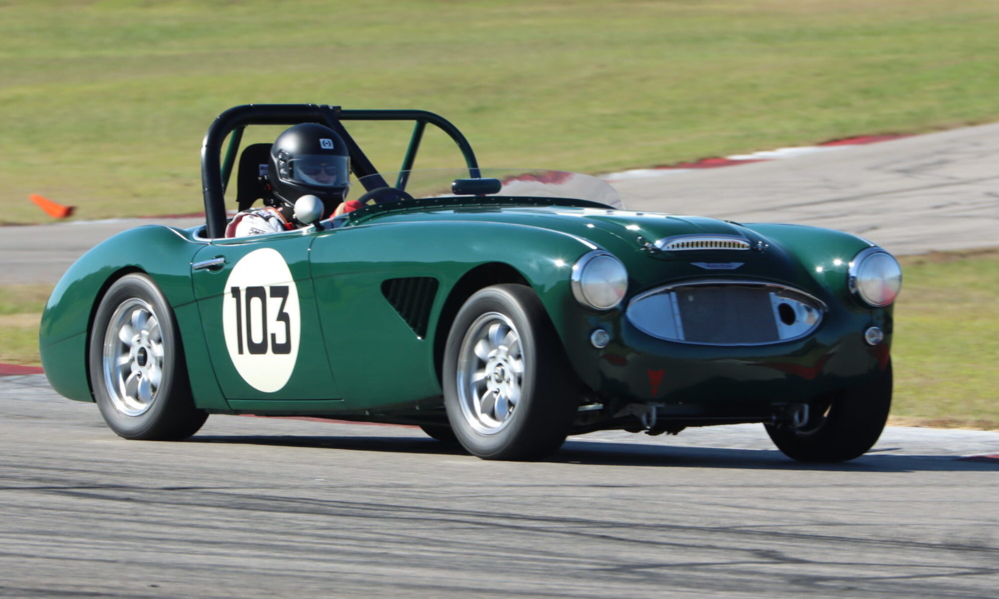
The following is the flag image I have. The Austin Healey script is quintessential to Austin Healeys. The script is what I would like on the helmet or visor. The format of the number also appears on my car and is a throwback to Austin Healey number formats on cars that were raced in the 50s and 60s.

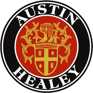
The following is the black and white Austin Healey logo.

Same logo below but with traditional colors.
Slightly modified.